

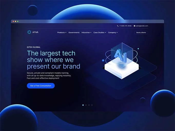

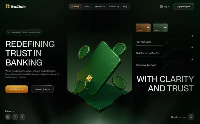


You can spend thousands on Google Ads, Meta Ads, SEO, and other marketing campaigns to bring visitors to your website. But what happens after they click?
If those visitors arrive on your landing page and leave without filling out a form, booking a call, making a purchase, or taking another desired action, your marketing budget is not working as hard as it should.
The problem may not be your traffic.
It may be your landing page.
A landing page is often the final step between attracting a potential customer and converting them into a lead or buyer. Even small issues—such as an unclear headline, a weak call-to-action, a slow-loading page, or a complicated form—can create enough friction to make visitors leave.
In this guide, we’ll explore the most common landing page mistakes that can hurt conversions and explain exactly what you can do to fix them.
1. Your Headline Isn’t Clear Enough
Your headline is one of the first things visitors see when they arrive on your landing page.
If they can’t understand what you’re offering within a few seconds, there’s a good chance they’ll leave.
For example:
Weak:
“Welcome to Our Digital Marketing Agency”
This doesn’t tell the visitor what they will get.
A stronger headline would be:
“Generate More Qualified Leads With Performance-Focused Digital Marketing”
Now the visitor immediately understands the potential benefit.
A good landing page headline should quickly answer:
- What are you offering?
- Who is it for?
- What problem does it solve?
- What benefit can the visitor expect?
Don’t try to make your headline overly clever. Your priority should be clarity.
The visitor shouldn’t have to read three paragraphs to understand why they should stay on the page.
2. Your Landing Page Has Too Many Distractions
A landing page should have a clear purpose.
If your goal is to generate consultation requests, everything on the page should support that goal.
However, many businesses fill their landing pages with:
- Too many navigation links
- Multiple competing offers
- Several unrelated buttons
- Social media links
- Pop-ups
- Unnecessary animations
- Promotional banners
- Links to every service
- Excessive design elements
Each additional distraction gives visitors another opportunity to leave the conversion path.
Keep the page focused
Instead of giving visitors ten different actions, decide what the one primary action should be.
For example:
Goal: Generate leads
Primary CTA: “Book My Free Consultation”
The rest of the page should guide visitors toward that action.
This doesn’t mean every landing page must completely remove navigation or secondary links. The right approach depends on the campaign and audience. But anything that doesn’t support the main objective should be questioned.
3. Your Call-to-Action Is Too Weak
Your call-to-action, or CTA, tells visitors what to do next.
One of the most common mistakes is using generic CTA text.
For example:
“Submit”
or
“Click Here”
These buttons don’t communicate much value.
Compare them with:
“Get My Free Consultation”
“Request My Free Quote”
“Start My Free Trial”
“Get My Marketing Audit”
The stronger CTAs tell visitors what they’re getting when they click.
What makes a good CTA?
A strong CTA should be:
- Clear
- Specific
- Action-oriented
- Easy to notice
- Relevant to the offer
- Consistent with the visitor’s expectations
Your CTA shouldn’t make visitors think.
They should immediately understand what happens next.
4. Your Landing Page Design Is Confusing
A beautiful landing page isn’t necessarily a high-converting landing page.
Design should make the visitor’s journey easier—not make the page look impressive for its own sake.
Poor landing page design can include:
- Too many colors
- Difficult-to-read fonts
- Poor contrast
- Crowded sections
- Inconsistent spacing
- Confusing layouts
- Too many animations
- Poor visual hierarchy
- Unclear buttons
A well-designed landing page should naturally guide visitors through the page.
A simple structure might look like:
Headline → Problem → Solution → Benefits → Proof → Offer → CTA
The visitor should know what the page is about, why the offer matters, why they should trust you, and what they should do next.
5. You Have Too Much Text
Providing useful information is important, but nobody wants to read a giant wall of text before understanding what you’re offering.
Long paragraphs can make a page feel overwhelming.
Instead, make your content easy to scan.
Use:
- Short paragraphs
- Subheadings
- Bullet points
- Bold highlights
- Clear benefit statements
- Relevant images
- Testimonials
- Icons where useful
For example, instead of writing:
“Our company provides a comprehensive range of digital marketing solutions designed to help businesses improve their online visibility, increase their website traffic, generate more qualified leads, and ultimately achieve sustainable growth through strategically planned marketing activities.”
You could say:
Grow Your Business Online
We help businesses:
- Reach the right audience
- Generate qualified leads
- Improve online visibility
- Turn more visitors into customers
The second version is easier to understand and much easier to scan.
6. Your Page Loads Too Slowly
You can have excellent copy and a beautiful design, but if your landing page takes too long to load, visitors may never see any of it.
This is especially important when you’re running paid advertising.
You’re paying to bring visitors to your page. If they leave because the page is slow, you’re potentially wasting part of that advertising investment.
Common causes of slow landing pages include:
- Large image files
- Too many plugins
- Heavy animations
- Unoptimized videos
- Poor hosting
- Excessive scripts
- Too many third-party tools
How to improve page speed
Consider:
- Compressing images
- Removing unnecessary scripts
- Reducing heavy animations
- Optimizing videos
- Using efficient hosting
- Keeping the page lightweight
- Checking mobile performance regularly
Page speed isn’t just a technical issue.
It’s part of the visitor experience.
7. You’re Ignoring Mobile Users
Your landing page might look perfect on a desktop computer and still be frustrating to use on a smartphone.
That’s a major problem because many visitors discover businesses through mobile devices.
Check your landing page on different screen sizes.
Ask:
- Is the headline readable?
- Are buttons easy to tap?
- Is the form easy to complete?
- Are images displaying correctly?
- Does the page load quickly?
- Is any content overlapping?
- Can visitors easily find the CTA?
- Is there unnecessary horizontal scrolling?
Don’t assume that a responsive website automatically provides a great mobile experience.
Actually test the complete conversion journey on mobile.
8. You’re Not Showing Enough Trust
Visitors don’t automatically trust a business just because the website looks professional.
Before giving you their contact details or money, they may wonder:
“Can I trust this company?”
“Has anyone used this service before?”
“Will I actually get what they’re promising?”
This is where trust signals become important.
Depending on your business, you can include:
- Customer reviews
- Testimonials
- Case studies
- Client logos
- Certifications
- Awards
- Industry credentials
- Product ratings
- Relevant guarantees
- Secure payment information
For example, a digital marketing agency could show a case study explaining a client’s challenge, strategy, and measurable outcome.
The key is authenticity.
Don’t use fake testimonials or make claims you cannot support.
9. Your Form Is Too Long
Imagine clicking on a landing page because you want a free consultation.
You expect a simple form.
Instead, you’re asked for:
- Name
- Phone number
- Company name
- Job title
- Company size
- Address
- Industry
- Monthly revenue
- Website
- Budget
- Five additional questions
That’s a lot of effort.
The visitor may simply decide it’s not worth it.
Keep your forms focused
Ask only for information you genuinely need at that stage.
For example:
Name
Email/Phone
Website
What can we help you with?
That’s often enough to begin a conversation.
However, shorter isn’t automatically better in every situation. If your sales team needs additional information to qualify leads, some extra fields may be justified.
The goal is to find the right balance between conversion volume and lead quality.
10. Your Page Isn’t Relevant to the Visitor
Imagine someone searches for:
“Google Ads management for small businesses”
They click your advertisement.
But instead of seeing a Google Ads page, they’re taken to your generic homepage.
Now they have to search through your website to find the service they were originally interested in.
That’s unnecessary friction.
Your landing page should be relevant to the visitor’s:
- Search query
- Advertisement
- Offer
- Problem
- Audience
- Buying stage
If someone clicked an ad about Google Ads, the landing page should immediately make it clear that they have arrived at the right place.
11. Your Ad and Landing Page Don’t Match
This is one of the biggest issues for businesses running Google Ads and Meta Ads.
Imagine your advertisement says:
“Get a Free SEO Audit Today.”
But after clicking, the visitor lands on a page that says:
“Welcome to Our Digital Marketing Agency.”
The visitor expected an SEO audit.
Instead, they’re presented with a general company introduction.
That disconnect can reduce trust and make visitors question whether they clicked the right advertisement.
For Google Ads
Your landing page should closely connect with:
- The keyword
- Search intent
- Ad copy
- Service
- Offer
For Meta Ads
Your landing page should connect with:
- Ad creative
- Video or image
- Campaign message
- Target audience
- Offer
- CTA
The visitor should feel like the advertisement and landing page are part of the same experience.
12. You’re Not Testing Anything
Many businesses create a landing page, publish it, and never change it.
But how do you know the first version is the best version?
You don’t.
A/B testing allows you to compare different versions of an element or page and learn what performs better.
You can test:
- Headlines
- CTA text
- Images
- Forms
- Offers
- Testimonials
- Page layouts
- Button placement
- Pricing presentation
For example:
Version A:
“Submit Your Details”
Version B:
“Get My Free Marketing Audit”
If the second version consistently generates better results under a properly designed test, you’ve learned something valuable about your audience.
The goal isn’t to make random changes.
The goal is to make decisions based on evidence.
13. Your Value Proposition Is Weak
Your value proposition answers an important question:
“Why should I choose you?”
A weak value proposition might say:
“We provide high-quality digital marketing services.”
Almost every digital marketing company could say that.
A stronger value proposition focuses on the customer’s desired outcome:
“Turn More Website Visitors Into Qualified Leads With Conversion-Focused Digital Marketing.”
Your value proposition should communicate:
- What you offer
- Who you help
- What problem you solve
- What benefit you provide
- Why your solution deserves consideration
Don’t hide your most important value behind multiple paragraphs.
Put it where visitors can see it.
14. You’re Not Tracking Conversions
Traffic alone doesn’t tell you whether your landing page is successful.
Imagine your landing page receives:
5,000 visitors
but only:
20 leads
That’s very different from receiving 5,000 visitors and generating 200 qualified leads.
You need to understand what visitors are doing.
Track actions such as:
- Page visits
- CTA clicks
- Form starts
- Form submissions
- Phone clicks
- WhatsApp clicks
- Purchases
- Bookings
- Qualified leads
Tools such as Google Analytics and Google Tag Manager can help you measure important interactions when they are correctly configured.
The objective isn’t just to know how many people visited.
You want to understand:
Where are visitors dropping off?
Which campaigns generate better leads?
Which landing page elements are helping conversions?
Which traffic sources produce valuable customers?
Without this information, you’re making optimization decisions based largely on assumptions.
15. You’re Forgetting What Happens After the Conversion
Getting someone to fill out your form is not the end.
It’s the beginning of the sales process.
Imagine a potential customer submits a consultation request and then hears nothing for two days.
By that time, they may have:
- Contacted a competitor
- Lost interest
- Forgotten about your company
- Chosen another solution
Your follow-up process should be planned before you launch the campaign.
Depending on your business, this could include:
- A thank-you page
- Confirmation email
- WhatsApp message
- Sales team call
- Appointment confirmation
- Follow-up email
- Lead nurturing
- Educational content
A successful conversion strategy doesn’t stop at the form submission.
It continues until the lead becomes a customer.
How to Create a High-Converting Landing Page
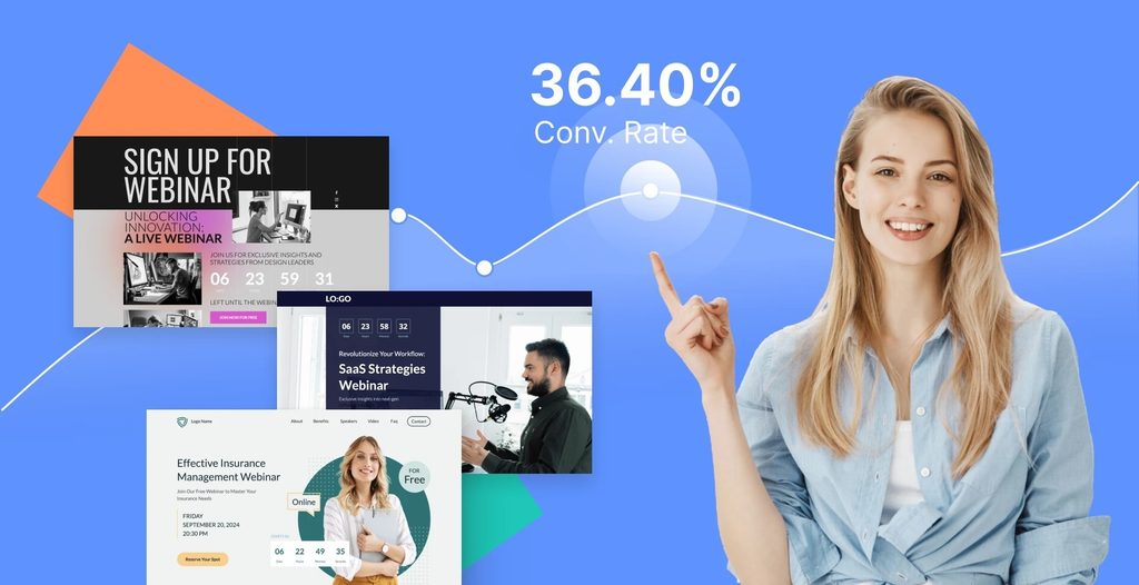
Fixing individual mistakes is useful, but it’s even better to build your landing page correctly from the beginning.
Here’s a practical framework you can follow.
1. Define One Clear Goal
Before designing anything, decide what you want visitors to do.
For example:
- Book a consultation
- Request a quote
- Buy a product
- Start a free trial
- Schedule an appointment
- Download a resource
- Submit an inquiry
Everything on the page should support that goal.
2. Understand Your Audience
You need to know who you’re talking to.
Understand:
- Their problems
- Their goals
- Their concerns
- Their objections
- Their expectations
- Their level of awareness
- What would make them take action
Your landing page copy should reflect the language and concerns of your actual audience.
3. Create a Strong Value Proposition
Tell visitors what they get and why it matters.
For example:
“Get More Local Customers With Targeted Google Ads.”
It’s simple, specific, and focused on an outcome.
4. Write a Strong Headline
Your headline should communicate the main benefit quickly.
Don’t force visitors to figure out what you’re selling.
Make it obvious.
5. Use a Clear Primary CTA
Choose the main action.
Instead of five different buttons with five different messages, establish one primary CTA.
For example:
“Book My Free Consultation”
Repeat the CTA naturally throughout longer pages when appropriate.
6. Keep the Design Focused
Use a clean layout with:
- Clear sections
- Readable fonts
- Strong visual hierarchy
- Relevant images
- Good spacing
- Consistent branding
- Easy-to-find CTAs
Every element should have a purpose.
7. Add Real Proof
Show visitors why they should believe you.
Use genuine:
- Reviews
- Testimonials
- Case studies
- Results
- Certifications
- Client logos
- Product demonstrations
Don’t make unsupported promises.
8. Simplify Your Form
Review every field.
Ask yourself:
“Do we really need this information right now?”
If the answer is no, remove it or consider collecting it later.
9. Improve Page Speed
Optimize the technical side of the page.
Compress images, reduce unnecessary scripts, optimize media, and regularly check performance.
10. Make Mobile a Priority
Test your page on smartphones, tablets, and desktops.
Your visitors should have a smooth experience regardless of their device.
11. Match Your Advertising
If you’re running Google Ads or Meta Ads, make sure your landing page delivers what the advertisement promised.
Don’t make users search for the offer they clicked on.
12. Set Up Conversion Tracking
Track the actions that matter to your business.
Don’t focus only on traffic.
Track actual business outcomes.
13. Test Important Elements
Once you have enough data, test different versions of important elements.
Start with areas that are likely to have the biggest impact:
- Headline
- CTA
- Offer
- Form
- Hero section
- Social proof
14. Keep Improving
Landing page optimization isn’t a one-time project.
Review your data.
Find problems.
Test improvements.
Measure results.
Repeat.
That’s how a landing page becomes more effective over time.
Landing Page Conversion Checklist
Before publishing your landing page, ask yourself:
- Is the purpose of the page clear?
- Does the headline immediately explain the offer?
- Is the value proposition easy to understand?
- Does the page match the advertisement?
- Does the page match the visitor’s search intent?
- Is there one clear primary CTA?
- Is the CTA specific and action-oriented?
- Have unnecessary distractions been removed?
- Is the content easy to scan?
- Are the benefits clearly explained?
- Are genuine testimonials or trust signals included?
- Is the form simple enough?
- Does the page load quickly?
- Does the page work properly on mobile?
- Have all buttons and forms been tested?
- Is conversion tracking installed?
- Are important actions being measured?
- Is there a follow-up process?
- Have you considered A/B testing?
- Is the page consistent with your brand?
Real-World Landing Page Examples
Digital Marketing Agency
Weak
Headline:
“Welcome to Our Digital Marketing Company”
CTA:
“Submit”
Better
Headline:
“Generate More Qualified Leads With Performance-Focused Digital Marketing”
CTA:
“Get My Free Consultation”
The second version communicates a clearer benefit and tells visitors what they can expect from the CTA.
Local Business
Imagine a dental clinic running an advertisement for emergency dental treatment.
A generic landing page might say:
“Welcome to Our Dental Clinic.”
A more relevant page could say:
“Need Emergency Dental Care? Book an Appointment Today.”
The second version directly addresses the visitor’s likely need.
E-Commerce Business
An e-commerce landing page shouldn’t simply show a product and a “Buy Now” button.
Depending on the product, visitors may need:
- Clear product benefits
- High-quality images
- Pricing
- Reviews
- Delivery information
- Return policy
- Product details
- FAQs
- A clear purchase CTA
The purpose is to reduce uncertainty and make the buying decision easier.
SaaS Business
Instead of saying:
“Our Platform Has Powerful Features.”
Explain the outcome:
“Manage Your Team, Projects, and Deadlines From One Dashboard.”
Then support the claim with product screenshots, benefits, testimonials, and a clear CTA.
Why Is My Landing Page Not Converting?
If you’ve been asking yourself this question, don’t immediately assume that you need more traffic.
First, examine the complete visitor journey.
Ask:
Did the right people arrive on the page?
Did they immediately understand the offer?
Does the page match the advertisement?
Do they trust the business?
Is the CTA clear?
Is the form easy to complete?
Does the page work properly on mobile?
Is the page fast?
Are you tracking what visitors actually do?
Sometimes one problem is responsible for poor performance.
Other times, several small problems combine to create a poor conversion experience.
That’s why conversion rate optimization isn’t simply about changing a button color.
It’s about understanding the entire customer journey.
What Is a Good Landing Page Conversion Rate?
There’s no single conversion rate that every landing page should achieve.
A reasonable conversion rate can vary significantly depending on:
- Industry
- Offer
- Audience
- Traffic source
- Search intent
- Device
- Product price
- Buying stage
- Geographic market
- Definition of a conversion
For example, high-intent Google Search traffic can behave very differently from cold social media traffic.
Instead of chasing an arbitrary number, establish your current performance and work on improving it.
A better approach is:
Measure → Identify Problems → Test → Learn → Improve → Measure Again
How DigiPromoters Can Help
Getting people to your website is only one part of digital marketing.
The bigger question is:
What happens after they arrive?
DigiPromoters helps businesses approach digital marketing from a broader perspective, combining audience targeting, advertising, SEO, landing page optimization, lead generation, and conversion-focused strategies.
Whether you’re struggling with:
- Low-quality leads
- Google Ads performance
- Meta Ads performance
- Low landing page conversions
- Poor website engagement
- Lead generation
- Conversion tracking
- Digital marketing strategy
the solution may require looking at the entire customer journey rather than focusing on one individual element.
A successful campaign isn’t simply about generating clicks.
It’s about attracting the right people and giving them a clear path toward becoming customers.
Conclusion
A landing page doesn’t have to be complicated to convert well.
It needs to be clear, relevant, trustworthy, fast, focused, and easy to use.
If your landing page has a weak headline, confusing design, too many distractions, a complicated form, poor mobile experience, slow loading speed, or a mismatch with your advertisements, you could be losing potential customers after you’ve already paid to attract them.
The good news is that these problems can be identified and improved.
Start with the fundamentals:
Clear message → Strong value proposition → Relevant experience → Trust → Simple CTA → Easy conversion → Tracking → Continuous testing
And remember: the goal of landing page optimization isn’t to create the most impressive-looking page.
It’s to create an experience that helps the right visitor understand your offer, trust your business, and take the next step.
If you’re investing in Google Ads, Meta Ads, SEO, or other digital marketing campaigns but aren’t getting the results you expect, your landing page may deserve a closer look.
DigiPromoters can help you evaluate and improve your digital marketing and conversion journey—from attracting the right audience to turning more visitors into meaningful leads.
Ready to improve your landing page and generate more opportunities from your existing traffic? Get in touch with DigiPromoters and start building a conversion-focused digital marketing strategy for your business.